The Voyage of the Dawn Treader Theatrical Poster
The Voyage of the Dawn Treader theatrical poster was debuted on a Polish film website today. Like The Lion, the Witch and the Wardrobe and Prince Caspian theatrical posters before it, the Dawn Treader poster is a collage of the main characters with one the title character (in this case the ship itself) being front and center. Check it out!
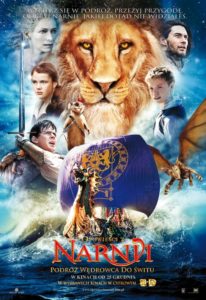
Download the high-res poster here
The approximate translation of the tagline is: “Take a Voyage of Adventure and Discover Narnia As You’ve Never Seen It Before”
Hopefully we’ll get the English version of the poster soon!
Thanks to icarus via MundoNarnia for the heads up!
UPDATE: Here is the English version of the poster.
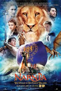
Thanks icarus and Daredevil for the heads up!




Ooooh! It looks cool! not sure that I like the fact that the white witch is on there….. sigh. December seems so far away.
Dragon Eustace Makes an appearance, looks rather odd though. Like it's not quite finished same with Reep. I was hoping for a better photoshop job too. Oh well.
SWEET!!!! but they still have the "N" on the sail backwards. i dont see how they can make that mistake.
that is so cool
Ooh, not bad! Not bad at all. Jadis is still kind of bothering me, but the rest is great. Dragon Eustace looks very different than I imagined, but I like it. Nice!
oh! I actually got first post! i don't think that's ever happened before! 😛
Not bad I guess. The Dawn Treader looks magnificent and I like the colors. But it looks like a giant Reepicheep is standing on the sail, and of course they're including the White Witch again. … What’s up with the dragon? Looks very weird. Are they going to try to make the dragon actually resemble Eustace?
"ooooo, aaaaaahhhhh" on the dragon…is Reep wearing an eyepatch, and "ummm…oookaaay???" on Aslan. otherwise I think it looks great!
Hey! At least Reepicheep isn't on the logo anymore!
Wow…SO EPIC! I'm totally looking forward to this movie! I wish it is coming out earlier!!!
Is it just me, or does it look like it's not totally finished? I like the pics of all the main characters, but I'm still disturbed about the White Witch being featured so prominently in everything. Interesting take on dragons. I wasn't sure it was a dragon at first, with those arms.
I'm glad Lucy doesn't look as blissed out as she did before. That pose and Eustance's pose I don't think I've seen before. Reepicheep looks like he did in the trailer, atop the mast. I'm more optimistic about this poster.
It looks really nice and better then the first poster. Susan and peter aren't there, YAY!!!!! 😀 I love it lots!
It's alright, but it could have been slightly better if the white witch was cut off and Aslan looked more majestic & grand..He looks too fake & cartoonish… hopefully there's more that come out & a better trailer, the movie seems boring though I know it won't be, but the trailer doesn't captivate an audience as the first Two did, same goes with their poster.
Well it's better than the previous stuff they've released but it still looks pretty horrible, and what's up with Aslan? That looks nothing like him. Not to mention the randomly placed White Witch.
This is when I start to wish Disney had remained the studio behind this film. They would have already released many behind the scenes videos, trailers, and posters to ensure hype was created. Fox seems to be doing the opposite, it's almost as if they don't want anybody to know about this film.
It. Has. Arms. The flying thing I mean. Arms. Since when does a dragon have arms?
And what's with the chipmunk that has a mouse's tail and a red feather sticking up out of its head?
The "n" on the sail is still backwards.
It has arms!?!
oh my gosh its so cool! umm….but Aslan is kinda…wierding me out a bit. i love Eustace, and the dragon. but the big image of the White Witch is really bothering me. now people who havent read the books are gonna think she plays a big part in the story, when really she was barely mentioned. and Lucy looks…ok. i think she could look better. the best on this poster i have to say is Eustace. actually, the only really good parts on here are Eustace and Caspian. why Aslan looks like that i dont know. i do wish they would change him to look more like a real looking lion like they did with the other movies' posters. i just love how he looked on LWW's poster, he looked real, but now this just looks so cartoony and fake.
omg ppl u r such winches all u do is complain and complain just shut up and enjoy!!!! if u dont like it well dont comment , leave the spaces to pll that actually wants to talk good stuff!! the poster looks awsome!!! and by the way the poster r drawings!!! hello thaTS WY IT LOOKS THAT WAY OK . lOVE IT THE MOVIE WILL ROCK!!!!!!1 =)
Ugh I can't see the dragon clearly enough! But aside from that great poster.
Woo, that looks cool! Lucy looks SO grown up. . .
But Euestace as a dragon looks just a little fake.
I like Reep! <3
Woohooo!! That is so cool! Man these updates are getting better and better everytime I see something new! Man on man how I cannot wait for this movie! And what I am really pumped on is how nobody is 100% sure if The Silver Chair will be filmed or not or if it will be next, but seeing and hearing news and polls about it kinda gives it a kick that it most likely is on it's way! Narnia rules!
good feeling right? 😉 lol
This is cool! But I think they should devide good from evil….
I'd fire whoever designed this poster on the spot. It's horrible and looks like a generic kiddie-adventure film. The whole concept of all the charcter faces is completely cliche at this point (and yes, the dragon looks pretty awful). It's like Fox is so desperate to recapture the audience for TLTWATW that they're putting out this rehashed crap that looked mediocre back when the first film was done.
I'd have done a wide shot of the Dawn Treader (port side, not head on) going over extremely stormy seas and a dark, disturbing looking sky above. Then in the far-left corner, where the ship is heading, the light would change and be weird and ghostly. Under the waves in the bottom of the poster would be a dark shadow of some appendages reaching out under the ship as if to grab it and pull it down.
That, IMO, would've been a lot more iconic and mysterious, and represent the dual nature of their voyage far better.
This poster, conversely, is completely off-putting and won't drawn in anyone but the diehard and kids under the age of 10. It just looks like they're advertising anyone of the disposable kids films that Hollywood pumps out every year.
So sad. Narnia deserves far better.
The ship gets two big thumbs up (unless you're Australian). The Witch gets two big thumbs down (especially if you're Roman).
so, why is Lucy so sad? other than that its awesome!
I HATE IT!!! I can't belive this. That's not my Aslan… This is a cheap piece of marketing not a piece of art as the poster from the last movies.
Hmmm… Dragon Eustace's face reminds me of those grasshoppers on A Bug's Life…
Posters are drawings? Really? I thought they had these things called cameras now and computers and Photoshop, but I'll take your word for it. I'm also a bit confused by why you're calling people winches. Perhaps you mean wenches? But we're not all female, so I'm still a bit confused. Can you enlighten us? I'm afraid I'll be up all night wondering about this. Also, did you recently buy the site from Tirian, since you're now telling people what they can post in the comments?
We're not allowed to post our comments if they suck? Our comments are just as valid as yours.
In my opinion, this sucks. The characters look crap, and aslan just looks weird. They should use the aslan from the aslan poster we saw. Also, the colours are way to washed out and icky. A nice deep purple, with oranges, yellows and green would have looked so much better. To be honest, this looks like a fan made poster.
I remember seeing a fanmade poster a few months back of the Dawn Treader sailing under a massive full moon. The execution was a little shaky, but the concept was so lovely I half-hoped we would get something as good for the VDT poster. A little disappointed now. Also disappointed that a steaming pile of crap like Eragon gets a better looking dragon than VDT. 🙁
I completely agree.
Considering that hideous poster of the Dawn Treader that made it look like a bath toy was official when everyone was sure it was fanmade, I'm not surprised the official poster looks this bad.
Hmmm…. Looks pretty good…from afar. Nice colours! Would've looked a lot better if Caspian and Lucy had changed places on the poster though. Looks really weird when the White Witch and Caspian are looking to the right when Lucy and Eustace are looking to the left. Reepicheep looks out of place and is way too big where he is. Dragon Eustace looks absolutely horrible! What VFX company is responsible for Dragon Eustace!? The Dawn Treader looks really good though and the water effects around her. I'd be able to do a much better job myself, but it's not the worst poster ever by no means.
I can't believe this is a oficial Narnia Poster. I feel so ashamed. It looks so cheap and idiot.
Hmm… I thought the Dawn Treader ship was one of the (very) few parts of the poster that looked good.
Not only is the poster rather generic, it's also badly done. The layout and blending is haphazard at best.
Rilian, seriously, what's wrong with the ship? It's one of the few parts of the poster that looks good.
Shame our first look at this amazing poster isn't in English.
It looks like they were trying to cram a lot into that poster. Design-wise, it's very cluttered and hard to look at!
I didn't even realise that the flying creature was a dragon until someone said so. Looked more like a flying monkey with a pig's head and a dragon's wings to me.
On a positive note, I did like everything below Aslan. The sailing Dawn Treader and the crashing blue waters. Beautiful. The bright colours are also a plus for me. (I'm a big fan of blue)
lucy looks like a drawing? dragoneustace looks cool. and i like edmund in the poster
WHY is the White Witch there? She's not important! Ed looks awesome, and so does Eustace. Lucy look a little odd in this pic, I don't like her hair 🙁 The dragon is not what I expected, and Caspian looks majestic.
Sadly the whole poster is a little amature. The characters look good but they make it look a little childish.
eee! i love it!! =) Very nice! Lucy looks a whole lot better in this. And to finally see the dragon up close… yes! I love how it looks!! =D
remember it's a foreign poster, the official might not look like this one
my dragons have arms =)
sigh
I've begun to accept the fact that Jadis will appear and be spoken of in this film (though I really don't see how her influence adds to the new through line (the dark island) they have created).
However it confuses me that they would put her on this poster considering Tilda Swinton said herself that she spent a very short time filming. My only assumption is that they a looking to market the movie to the non-book fans of LWW.
I'm really looking forward to seeing how the feel, themes, and characters of the book translate into the altered plot.
The hopeful,
Lirimaer
I'm hoping for a better poster. But it will do. The kids and Caspian look good. The animals need work. Oh, well. The poster is not the movie.
Yeah I thought it looked…pretty bad. I dunno what they did to Lucy's and Eustace's faces =0
ditto
Reviewers said the dragon looked stunning, this picture isn't so flattering for such a glorious reptile.
What do you mean??????
Why would they put the White Witch on the poster before Liliandil?
That was weired . . . that wasen't a reply . . .
Ahhhaaaaaaaaa!!! Reep looks like a complete dork with that dumb grin.
Oops never mind. I zoomed in on him and what looks like an eye patch and ridiculous smile is just a shadow on his face and his white chin.
Look at the sail, the N is clearly backwards. They've done this before and we pointed it out then. I think the marketing people are letting the interns do the work or something. 😛
Stupid witch! Awesome dragon! Absolutely outrageously amazing Dawn Treader!
super!
Why do they have to include White Witch in every poster? And what´s up with the dragon? It looks more like a Krillitane from Doctor Who ep School reunion than a dragon.. when I first saw the poster I thought "there are no bats or flying squirrels in the book, are there?". I like the colours, though.