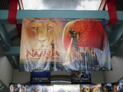
The Latest Dawn Treader Banner in Theaters
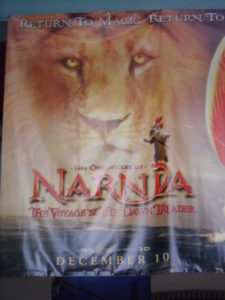
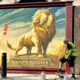
Huge thanks to Narnian1 for running out to the theaters for us and snapping a few pictures for us!
This banner first showed up on Narnianos a few weeks ago, but wasn’t confirmed to be a legitimate poster until after I was gone on vacation, so we’re a bit slow reporting on it.
Hopefully now that it’s out in theaters, we’ll be able to get our hands on a hi-res image of it!
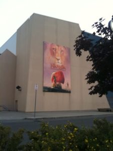
UPDATE: NarniaWebber Jacob C sent in an image of a slightly different banner hanging on the outside of the movie theater.
Thanks to Jacob C for the image!




Sweet!
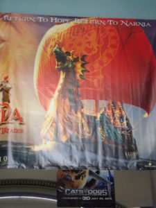
isn't the Dawn Treader's sail supposed to be a deep purple color? But I guess they can't make everything exactly the same as the book…
But otherwise really cool! I'm very excited! thanks narnian1
maybe that's just the way the sun is shining on the sail?
The sail is purple in the trailer….I guess the poster is different.
Yeah, it's a Barney ship, green and purple! 😛
The Dawn Treader's sail is purple in the movie. We've seen enough pictures and footage that people should know that by now.
Your welcome, I tell you- my sister and brother thought I was crazy going to the theater with a camera to take the picture of this banner.
oh, and sorry for the light glare, nothing I could have done about that I'm afraid. 🙁
Did you tell your brother and sister that there were a whole hoard of crazy people on this website waiting for these pictures? 😉
haha yes, I told my sister. She thinks we are all extremely obsessed though, which isn't far from the truth.
hahahaha thats funny my friends thought i was crazy cause im countin down the days
Ooh! Me too, me too!
One crazy, obsessed Narnia fan thanks you!!!
thanks !
Tee-hee. I think just about everybody I know would think I was nutty too if my sole reason for going to a theater was just to snap a picture or two (or three or four) of a poster. lol (Actually, they all think I'm nutty /without/ my doing that….)
Lastest? I hope not! I think you guys mean latest. 🙂
Ha! Fixed. 😉 Thanks
Well its still not perfect – i can overlook the fact that the dawn treader is backwards, as only the most hardcore geeks like us are going to notice the design of the sail being in mirror image, but the way they've messed with the coloring on the Dawn Treader sail is still disappointing considering how awesome the original image looks on Narnia.com. And reepicheep of course still looks wildly out of place, just as he has done on everything so far, and there are a few other minor problems with the overall composition and editing of the poster – but compared with the ugly monstrosity of a poster that showed up yesterday, this is positively fantastic.
Ugh you're right about the color. Not cool! As far as Reep being out of place, I've been thinking about that aand I actually think he's supposed to be out of place. I think thats kind of the trademark of his character. He always seems "out of place" in the book, (he's a mouse for goodness sake,lol) but I think thats what makes him so lovable and whimsical.
Ya the coloring isnt my favorite 🙁
Great! More advertising! But isn't the sail supposed to be purple, not red? Or is it just the lighting?
Yes, it's supposed to be purple. I'm guessing that it was changed for this poster so that the colors would match.
Ah, okay. Makes sense.
The Dawn Treader is flipped; the sail is red; that horrendous tagline is still present; and Reepicheep still looks tacky standing on top of the logo. But it is better than the one that was rumored to be the official poster.
Heh, those are my exact thoughts! x3 When I first saw this, I was like "red sail whaaat?" Then, "Oh, at least it's a COMPLETE sail."
Red sail? More weirdness in the marketing.
It's not red. That's just a different coloring edition. See the original: http://www.lemondedenarnia.com/medias/goodies/wallpapers/narnia3_wallpaper_1.jpg And now after some edition: http://img203.imageshack.us/img203/8425/version2w.png
it'd the lighting that they used in the banner
I noticed that too. And I still dont like reep on the logo.
Yeah!!!! More posters!!!! That means we are getting closer. We only have 4 more months!!!!!!!!!!!!!!!! Keep the story of Aslan alive!!!
I tell ya, I didn't even notice the ship was flipped, still can't tell how you all notice it. as for the red sail, it didn't even cross my mind that it's supposed to be purple, I guess it was done to just match the banner like daughter of king said.
Thanks for the pics, narnian1! 🙂 Yeah, I agree with everyone else. I don not like the sail whether it's for contrast, matching the logo or not. Other than that it's cool!
oops. *I do not like*
It is even more beautiful on these photos!
AWSOME!!!!
The red sail is odd, wasn't it purple in the trailer?
The red sail has been color adjusted for this banner. It's pretty purple here.
http://www.narniaweb.com/wp-content/gallery/vdt-production-photos/image_78.jpg
Sweet!
Beautiful!!! December 10th gets closer by the minute…
Maybe it's gong in a different direction instead of being flipped or backwards. I like it. The Voyage is getting closer and I'm so ready.
Nope, it's definitely flipped. Look at the "N" on the sail.
I do not think that's the letter "N". But the image is surely flipped.
thats definitely a flipped "n"
WOW!!!! WE CAN'T WAIT!!!!!!!!!!!!!
yea i as at the theaters here in canada ontario and i saw a big banner at the theaters outside
… OK, that's a weird looking poster… You know, if Fox doesn't step up and do something GOOD with this marketing, VDT stands an excellent chance of being as bad a financial flop as PC. Sure, PC wasn't that great of a movie, merely comparing it to many of the other family flicks that have come out recently. But Marketing can often make or break a film.
I'd say Reepicheep on the logo makes it look more childish. And I'm not sure what's up with the red sail. But generally, I really like it as a poster! I bet it is very eye-catching to see in person!
that is is! I first saw that banner 3 weeks ago when I went to Inception's opening midnight show- my eyes caught that banner as if it was right in front of my face rather than up in the ceiling.
That is awesome! Though you can tell that the other poster 9one a lot of people bashed) was obiviously unfinished that Fox really was working on.
That's more like it. Show the Dawn Treader! Sail on VDT! 🙂
Ok I thought I was really hardcore, but I have to admit, I did not notice that the DT was flipped. I DID however notice (with disgust) that the sail is RED!! UGH!!!! Maybe its just a color issue with the camera that took the pic?? maybe?? hopefully??? Anyway as far as poor Reep goes, yes, he looks out of place. He is ALWAYS going to look out of place, he's a mouse! He can't help it! lol. I really like it though, like I said in my above comment, I think thats kind of a trademark of his character, it makes him more loveable and whimsical to be a small mouse among "giants" Its why we all love him!
Nope, it's not the camera. I can guarantee that the sail is in fact reddish in the banner.
the ship is the exact same one on narnia.com
exept it has flipped you can tell by the N shape symbol at the bottom.
Red sail???
SO AWESOME! I LOVE IT AND CAN'T WAIT TO SEE IT AT THE THEATRES IN MY TOWN!!!!!!!
That's really cool! I just don't understand why the sail on the Dawn Treader is red and not purple… maybe its because the theme is evening or something but I just find it odd… Other than that its good to know that the word is getting out there!
My guess is because the font is red, and they thought purple and red would sort of clash…
What I want to know is… who cares if the colors clash! I actually like the poster, but I don't think the sail's color should have been changed. I don't think purple would have ruined the poster, but instead drawn one's eye toward it.
Perhaps we should just be grateful that there is a poster at all!
Neat! I cannot waittttt!!!!!!! Yahhhooo
For some reason the poster reminds me of the BBC Voyage of the Dawn Treader. That's not such a bad thing…and I like the poster all right…but I wish the poster-makers could be a little more imaginative. I liked the posters for LWW and PC better. But this new poster does convey the idea of the movie without giving out any spoilers, and it's simple but eye-catching.
So does anyone think there will be any more posters, or are these ones going to be it? I'm feeling like we haven't hit the climax yet, and I'm hoping it's going to be good.
If they do the marketing right the climax will come at the end of November/beginning of December.
Wonderful!!!!
Awsome!
No big news for me. I saw this banner a couple weeks ago at Narnia Fans.com.
I like how they are emphasizing Aslan and the boat more than the actors themselves. It makes me think and hope that Aslan will be more in this movie than Prince Caspian.
I'm so glad to see everything coming alon but I'm oddly dissapointed that fox is making changes like that (referring to the sail). I hope that all these things are completly fixed for the movie. Sail On VDT!! 🙂
I'm 99.99% sure the sail will be purple in the movie.
I am too but another director is definitly scaring me 😛
I think VDT has the most to live up to since so many people are expecting so much from it 🙂
All you have to do is visit Narnia.com and you'll see the sail is purple.
I saw that poster weeks ago. I got really excited, especially when I saw the cut out!
I don't like the coloring and Reep looks stupider than ever perched on the logo, but it's a definite improvement over what we've seen so far.
Dawn Treader was mentioned in a British magazine called The Radio Times this week!!!!Transcript:
"One to watch:Will Poulter,
Will Poulter made his debut at just 14 in acclaimed, low budget 2007 feature film Son of Rambow
Currently: Now 17, Poulter is the outstanding talent among the youngcomedy troupe who feature in the new series School of Comedy
NEXT:POULTER STARS IN THE PIVOTAL ROLE OF EUSTACE CLARENCE SCRUBB IN THE NEXT INSTALLMENT OF THE CHRONICLES OF NARNIA:THE VOYAGE OF THE DAWN TREADER."
It's nice to see Narnia mentioned, even if it's just a small article!!!!
Also, The LWW was named 33rd in the Radio Times 100 Greatest Family Films, which isn't bad!!
AHHH! That is totally awesome!!! *wishes her movie theater had VDT posters*
Wow!!! That looks awesome!!! Is it just me or does the Dawn Treader's sail look red? Or is that supposed to be part of the lighting for the banner? Long live Aslan and sail on VDT!!! 😀
COOL!!!!
Ooo! Those look really nice! I'll be sure to take pictures of any Voyage of the Dawn Treader related things as soon as I see them! Awesome banners!
narnian1, thank you sooooo much! I love them! 9So does my mom) 😀
FFJ
*So*
Coolieo!!!!!!!!!!!!!
Hey, How are you!
They are great – I want to see Lucy and Edmund and Eustace on some. I went to watch Toy Story 3 today in the UK and was gutted the Voyage Trailer wasn't shown. Has anyone seen it as a theatre trailer in the UK? Did it show before Toy Story 3 across USA? Anywhere else? In front of any other films? When will trailer 2 be out?
From what i have heard from my freinds it was not shown before toy story 3, but it was shown before Eclipse and Ramona and Bezus
I saw Toy Story 3 a few weeks back and it was the second or third trailer they showed. But I live in the US,so Im not sure if its just something with the UK or what. Sorry though!
Thanks both of you for your replies – i just hope this film gets widely publisised – hardly anyone I know knew about Prince Caspian before i told them.
The movie comes out in less than 4 months and this is the best Fox has to show? This poster looks horrible, Aslan doesn't even look like himself. They're going to have to step up the marketing and start creating some hype soon if they even want this film to have a chance at the box-office during a very heated winter season. With Harry Potter 7, Tangled, Tron Legacy, Yogi Bear, and Little Fockers all opening during the same time I'm starting to feel Fox isn't doing enough and are throwing this film away.
Yeah, I agree. They'd better get crackin'…
We need a better trailer than that, too, a little more comprehensive,otherwise people who haven't read the books or anything will not be interested.
I think Reep would look really cute with one little mouse foot forward and his sword extended. when he bowed to aslan in PC it really made me chuckle. THANK YOU SOOO MUCH NARNIAN ONE!!!!!!! THAT WAS A LOT OF EFFORT AND WE APPRECIATE IT!
at 2nd glance, i guess if he extended his foot any farther forward he'd fall off the letter-LOL
also, red has been scientifically tested, along with yellow, to have the most impact on the human brain- that's probably why they went with it over a purple sail for an ad.
Sail On VDT!!!
Better than the teaser. i thought the sail was purple.. but o well
And I dont like reep on the logo…Laame..
i love narnia
Gives me chills!!!!! I am so excited! I wonder why my theaters don't know where it will be playing down here yet! I want to buy my tickets for opening night before it fills up!
It's red… The sail is red…
WHAT?
Oh, gotcha. It's good to read all of the comments first. Color adjusted. Thanks.
yay!!!!!!!!!!!!!!!!!!
So,I think its very pretty,but it is a little odd that the sail is red when in everything else it's been purple. But Im not going to harp on that,cause I think everyones noticed it anyway! ^.^ I wish they would make more posters with Edmund, Lucy, Caspian, and Eustace though-especially Eustace,considering he's kind of one of the main characters. Oh well though! There's still four more months left for them to make more posters!
One step closer to the day!! Very nice!
WHOA. Love it
Whoa, Reep looks…lame. Sorry, but he's just standing there in the middle of nowhere. And hopefully they come up with a better tagline. "return to magic, return to hope, return to Narnia????!! That's terrible!
Oh, well, still can't wait to see it! 🙂