Book Cover Art for The Voyage of the Dawn Treader
Amazon and HarperCollins have added the cover art for three of the The Voyage of the Dawn Treader movie tie-in books to their websites.
The Chronicles of Narnia Movie Tie-in Edition for The Voyage of the Dawn Treader (includes all seven stories in one book). Available for Pre-order here.
The Voyage of the Dawn Treader Movie Tie-in Edition (Rack). This edition doesn’t appear to be available for pre-order yet. The cover art can be viewed on HarperCollins’ website here.
The Voyage of the Dawn Treader Movie Tie-in Edition (Digest). Available for pre-order here. The cover art can be viewed on HarperCollins’ website here.
All movie tie-in books for The Voyage of the Dawn Treader will be available in stores on Oct. 26, 2010. As the cover art becomes available, we will add them to our Merchandise gallery along with titles from The Lion, the Witch and the Wardrobe and Prince Caspian here.
Thanks to icarus for the heads-up!

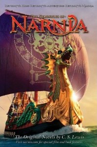
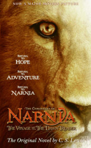
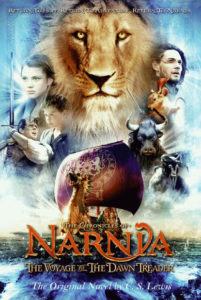

I really like the second one. Love the way you can see the DT in Aslan's eye – like he's watching over it:) Still think the first one works best with the book. And the third one is alright, but still too much.
HaHaHa That's hilarious!!! 🙂 @Lady Courage I didn't know they put little ridges on decks for cattle to stand on, neat! Makes sense the minatours weren't there in the book :/
lol Glad you enjoyed it! 😉 But it's true! I'd like to give whoever came up with that idea the job of loading cattle in a truck for just one day! Maybe they'd get it then… I hope I'm wrong and they've come up with a logical way around it. The minotaurs being there is bad enough, but I'll go crazy if they don't do something about the problem of hooves on wood. :-/
i can't wait to see them on books!!!!!!
I LIKE ALL THREE POSTERS!!!!!!
i think the third one is sexy
Ahhhhhhhhhhhh. . . . I love it. . . .
My favorite one is the Dawn Treader. . .
Second the Aslan one. . .
Third the collage one. . .
Ther're all so coooooool. . .
I like the first two, the last one is okay, but I just hope they don't ruin the books, because they did that with Prince Caspain.
I love it all you guys! And no one can change my mind about that! I just wish in the third they had done a better job of Caspian and Edmund. You have to admit that they are a little strange, considering how they did on the past two.
By the way, who likes that beard on Caspian? Makes him look a bit older and kinglier….I think.
Oh please. I thought no one wanted so much of him.
I think the first one is lovely,but I dont like that it includes all 7 of the chronicles. I think the second cover would be more appropriate for that purpose,and the first one would be good for just the VODT. I really like the first and second, and the third is pretty,but it looks more like a movie companion book. And why do they keep including the tagline when its never the same? I think "return to hope,return to adventure,return to Narnia' is alright,but if they're going to have to have a tagline I think it should be "Return to Magic Return to Adventure Return to Narnia" cause the hope part sounds kinda cheesy.
But back to the covers-I like them,but probably wont buy them
I really had my heart set on having Lilliandil on the cover. And I would have named her Shamira, because the name means diamond and that is kind of like a star, right?
Get a better look at Caspian and Edmund! I could have done better.
Agree – the third one is too busy. They should remove some of the characters to clean it up.
No way! i just saved those covers, they are AWESOME!
Ditto, ditto, definitely agree!!! Yeah, that pretty much sums up what I was going to say, ~queenSUSAN~ and narnian1!!! Thanks for your comments. And sail on VDT!!!
Yeah, that's what I think!!!
Definitely agree. Yeah, that pretty much is what I think.
Yeah, that's what I think. I'm wondering why she's not on any of them.
Sexy? It looks almost as childish and crowded as the Prince Caspian DVD cover.
I like the first one the best. I hope they do something similar to that for the DVD cover. In my opinion, simple covers are the best, because when I'm trying to pick a movie to watch from my choice of movies I have, I rarely watch the movies with crowded covers, because the whole movie flashes before my eyes before I even watch the movie because of the cover.
i love these
The third one looks like something some guy made in photo shop from that first huge banner we saw.
Thank you Austra. 🙂 Actually, I believe I've changed my opinion about the second one. I love the fact that it's Aslan, he's my favorite character, and the poster is gorgeous. But I don't think it really reflects VDT in particular. For all the Chronicles, it would be magnificent. But VDT…I like the first one best. 🙂
The cover art for the books look great. I especially like the first and third ones. Can someone explain what it means by rack and digest editions please?
The first one is brilliant! I think I'm gonna get that one.
but I need a new englisch edition of VDT, too.. Mine is very very used…
so I think, If I don't get an american pre 1994 soon enough I think I'll pre order the second one…
Wow – I love all three! i really like the third one – I like the detail. But I also love the other two – they're all amazing!
"Rack" and "Digest" both refer to the size of the book. A "rack" sized book being a book of standardised size to fit into a conventional book rack slot at the book store. As for Digest size, i don't know where it gets its name from, but you can read about it here http://desktoppub.about.com/cs/paper/f/digest.htm or here http://en.wikipedia.org/wiki/Digest_size
First is great, second is boring, third is crap.
The first one was very nice
The second one could be the cover for any Narnia book
ANd the third one was my favorite. I really liked it!
Eeeppp!! 😀 I love the 7-books-in-1 cover, with just the ship! It's gorgeous!! But, I will probably end up getting the digest one. I have this plan about getting my Narnia series as the movie tie-in editions, so, they better make ALL the movies!! 🙂
I like the first one, the 2nd one is a little bit to plain for me, and the 3rd one is so unrealistic.
I LOVE THEM! 😀 Although I don't like how Aslan looks now…it's weird O_o
The first looks totally awsome, the second looks okay, and the third looks just plain weird.
I like how the first one's a bit majestic, the second is, I agree, a little odd, and the third reminds of a sad star wars poster. Don't get me wrong I love the characters, but it's a bit much.