New Poster? Or Really Good Fan Art?
We were contacted a couple days ago about an apparent new poster and production art for the movie. At the time it was decided to not post it as we felt very strongly they were fan art posters and nothing more. However, since then, other sites have done stories on these posters and promotional photos, including some sites stating they’re official and we felt we needed to comment.
We still stand by our original feelings that these are NOT official, only fan-made. Take a look…
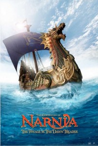
The most obvious reason we believe this to be fan-made is that the sail on the Dawn Treader is incomplete. Fox and Walden would never, EVER, release incomplete art on one of their posters. In fact, if you remember back when the Dawn Treader was being filmed at Cleveland Point, the sail was cut off at the exact same point, meaning the original photo probably came from there. Not only that, there is no Fox and Walden logo, no release date, and no big, bold 3D.
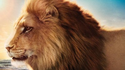
And the picture that seems to be confusing the most people… This picture of Aslan came from the Disney/Walden Facebook page for Prince Caspian. You can see the original photo in our gallery here.
Thus far Fox has sent all new posters and promotional images either straight to us or to the official Narnia.com website. So sorry Dawn Treader fans, nothing new from the production, just fan art (albeit very GOOD fan art).
Thanks to everybody who contacted us with this story!
UPDATE: We think we’ve found where the pictures originally came from. They’re being used as promotional images on both Italian and French Dawn Treader websites. (Example) So we admit that we were incorrect about it being fan-art and apologize for reporting so. As this is now the case, it’s likely that these images were sent out before they had completed the full design of the ship.





If you look at the top left corner of the ship poster from the right angle (try putting your head down and looking up at the screen so that the darks get darker) some splotches appear in the glare. To me it looks almost like someone's face, looking over their shoulder.
Do you think that's a coincidence, or do you think it could be the artist's hidden signature…?
Don't mean to start any conspiracy theories, but… 😉
i didn't notice those
It would make absolutely no sense for Fox to release such a shonky looking photoshop image of the ship as an official movie poster, when they already have the following stunning looking picture of the Dawn Treader which has a full mast, a full sail, and added water effects that actually look realistic: http://trailers.apple.com/trailers/fox/thechroniclesofnarniathevoyageofthedawntreader/
THAT is how you do it.
You're right, it does look like faces. Almost like two faces to me. The top one makes me think of Caspian. I wonder if the person who made took the sky background from another poster or something and modified it, covering up whatever might have been there before.
Personally, I think it's fan made. But still, it looks great! 😀
Even if it is fan made, it's pretty damn impressive. No, it's not up the standard we can expect from a movie studio, but wow. I applaud the maker for skill.
I don't know anything……… except I saw a HUGE poster that looked pretty much exactly like this hanging outside my local theater…….. The only difference is that it did have the release date and "3-D" on the poster as well….
It looks like a toy Dawn Treader floating in a bathtub. Average work if it's fanart, downright horrible if it's professional.
i read about that on narniafans 😉
Looks good, cool fan art
that looks almost as if it was real!
I can see it, but it might be like seeing the man in the moon. It's there, but wasn't put there to look like a man in the moon, just a coincidence….we'll see.
It's a mermaid actually. 😉
Okay my bad i was looking at the bottom not the top, please ignore me.
I don't think this is a piece of fan art nor do I think it looks like a toy floating in a bathtub, it wouldn't make waves.
yeah! it's brilliant work for a Fan, but for professionals it looks way to much like photoshop. aspecialy when you look at the line between water and the dawn treader. also I think the ship seems a bit too high, the water to transparent (I believe the "underwater part" of the ship should be more indistinct) but I know, there are realy cheap made movie posters, so I wouldn't say that that couldn't at any chance be a real poster but I don't think it is.
as fanart it realy is a remarkable piece of work.
I love the composition and the focus of the poster and how it sells the adventure of the book but the image isn't clean enough, nor professional enough to be official. I like the water effects though. An above-average piece of fan-art but nothing more.
Such bored people. Still, Fox has to do something ASAP about the marketing.
I think its fan made
Actually, this really is an official poster. First of all, there is a Fox and Walden logo on it, if you look very carefully at the bottom right of the poster. The image is so low quality that it's hard to see. You can also see there is fine print.
The fact that there is no release date means nothing. There's lots of official posters for Prince Caspian that have no release date that can be purchased at this website: http://www.starstore.com/acatalog/Starstore_Catalogue_CHRONICLES_OF_NARNIA_POSTERS_5842.html
The fact that the sail is incomplete, and the artwork looks photoshopped isn't surprising compared to all the other wacky things that Fox has been doing, like releasing a trailer with the white witch talking, but not Caspian talking? Or the fact that Peter and Susan had Narnian clothes on.
If it really is real, then they need to fire whomever made it. Forget buying that poster, they'd have to pay me to display that ugly thing.
I agree. I think it's quite a pretty poster at first glance, but I hope it isn't official.
I saw new poster at an Edward's Theater. It looked similar to this, but I think it was different.
Yeah, very BORED people. They should just keep it for their own personal use, or put it on a graphics site for poeople, or sell it as an unofficial poster. It is very pretty, just not professional. Some person made a "Good Doctor" poster (it's a TV show in production. Orlando Bloom is the lead role) and claimed as official, so it appeared on fan sites, and everything, until one of the producers called a fan-site owner and said it was a fake. It wasn't professional looking enough. Sheesh, why do people have to lie about posters!
The Aslan one looks real. the sea with the sunset behind him. it looks like it could be from the movie. I really like the first one so i hope its not just fan art
There are zero faces in this "poster". I've played around with it in Photoshop now for a while and trust me, if there were any, I would've seen them.
Why were you looking at it from that angle btw? 😉
Don't know why some people claim to see faces in it, but it migh be the combination of the clouds in the background and the horrible lens flare.
haha…good one!
This is how they should've done it: (My work) http://img64.imageshack.us/f/dawntreaderposter.jpg/
Aslan looks awesome!!!!!!!!!
Aslan dosen't look like a puppet!!!!Yea!!!!!
SSSSOOOOOOOOOOOOOOO AWESOME!!!!!!!! Love the posters!
Definitely really good fan art. Someone had a few late nights making that Dawn Treader poster. I do graphic art I know something like that would take forever. 😉
I'll bet they are intentionally downplaying caspian in the new trailer because they consider PC a "flop" and are trying to build an association in the public's minds with LWW, hence the inclusion of oscar winner tilda and the 4 kids- barely any thing with caspian or eustace who is unknown to non book readers.
notice the lettering is from the prototype from about a year ago- in the new official materials, the fancy filigrees are toned down, probably cause it was too hard to read at a quick glance. so i vote this is fan made, or maybe they are just trying out stuff in small places and deciding what to go with in the end, more near the real release.
Yeah, I do see it!!! Cool!
Mayhap and perchance you're right!!!
This is actually really cool. I think that if it is fan-made, it's really, really, really good, and I couldn't do half so well!
i think it's gorgeous, i'd buy it as a poster!! I wish people would stop insulting the good people who are trying to bring narnia to us- the superfans should be the most supportive, not the biggest know- it- all snobs. they might just throw their hands up in disgust at our ingratitude—-and hang it all up, thinking the core audience is against them and their best efforts-or just impossible to please. is that what we want? I don't!
Maybe I just don't see what others do. I use Photoshop regularly, thought mostly for work and school and not fan editing, and I can't see why this is unprofessional. I think it looks fabulous.
Again, with the sail – I haven't examined it, but I had thought that I just couldn't see the top of the sail because of the angle – shooting from the bottom up. It reminds me of the trailer scene where Lucy surfaces, turns around, and calls Edmund; the shot is on level with her but looks up to the ship from down on sea level. If that were the case, the sail would look cut off at the top, as the top of the sail is hidden in the billowing, the same way the features of the top of the Empire State Building kind of disappear when you're standing at the foot.
I think it could be the poster but then again maybe a fan made one I really don't know
you've got apoint but i agree with Aslan's Meado
wow i love these pictures i like aslan the most.
Neat!
FFJ
Well I havent actually seen this image anywhere,however at my local theatre they have a huge display of this poster here,my friend got pictures with it.
http://farm5.static.flickr.com/4007/4671848385_266eee8c1c.jpg
and ive also seen this one at another theatre
http://www.comingsoon.net/nextraimages/narniateaserposter.jpg
Exactly,and not to mention the fact that the Narnia movies have been known to do some pretty weird things when it comes to the posters-in LWW,they photoshopped Edmund's head onto Peter's body for the movie cover/poster. So I wouldnt doubt that this is a real poster.
It is amazing! I wish i could draw like that! 🙂
If that's their best effort then clearly they need a new career. As for being supportive, we'll be supportive when they start demonstrating they actually care what we think and stop pandering solely to the mainstream viewing audience.
so awesome!!!!!
I told you it was official.
Looks like a fanart photoshop job to me. There isn't a water break behind the ship, and the ship is at full sail. The water in front of the ship just looks tossed around. Maybe it's just me, but the sky looks like a few pictures mashed up together and smudged in the corner where the sun is. The boat itself looks like it was cut out and pasted, because the lighting is all wrong – it looks to me that all the lighting should be from behind where the light source is, instead of the starboard side, and there's no reflection from the water on the port side, where it's unusually dark.
If it was an actual poster, they probably would have added more to it to give it more interest than just the boat, as well as found any other abnormalities.
Now that I'm done tearing it apart, it is otherwise a fun piece.
Well it is very good fan art!
These pieces ARE fan art! National Geographic created them for their Dawn Treader competition, which is why they're appearing on French and Italian websites. I'm not convinced the production ever created these pieces. But I could be wrong.
Fan made or not, WAY better then the teaser poster!
Ok, first of all, that CAN'T be fan art, can it?
Aslan looks sooooooooooooooooo gorgeous!. . .
That Dawn Treader is a nock out! 😀 😀 😀 😀 😀 😀 😀 😀 😀 😀 😀 😀
Well, I kinda like the teaser poster better, cause it looked some what dramaticer.
Hm. . .well, I guess it COULD be fan made. . .
Beware! One might think it's real! LOL
Nice work, congrats! I'd like it was a real poster.
I don't see anything
LOOKS MORE LIKE AN OLD MANS FACE